Are you a fan of using visual aids for teaching but don’t know how to make one for your own? You are googling visual content that fits your topic you tend to teach tomorrow but can’t find a suitable one? In this article, we would like to provide a guide on how to visual aid design for teaching. If you are already feeling confident, feel free to skip the content and scroll down to the bottom, there is a list of platforms you can use to make your own visual aids for your class.
A Step-by-step Guide to Designing Visual Aids in Teaching
#Step 1: Nail down the learning objects and your targeted audience
The important step before designing the right visual aids in learning and teaching is to know your students well. Understanding students’ learning behaviors, especially at the primary level, is crucial to creating an effective lesson. Although this tip might sound rather obvious, there are learning traits of a certain age group that might be less noticeable. Incorporating gamified eLearning examples can also provide insights into how different approaches resonate with various student demographics, further enhancing your design process.

Another thing you need to know is the learning objectives of the content you are expecting the visual aid to deliver. To determine the learning objectives, you will need to ask yourself two questions ‘WHAT’ and ‘HOW MUCH’.
For example, even within one subject, different lessons have different learning objectives. Take math as an example, in a lesson about what is multiplication certainly will have a different aim than a lesson about how to do multiplication well.
After determining the main features of your student’s learning style and the aim of the lesson, if you are satisfied with your choice, then let’s get on with step 2.
# Step 2: Understand and simplify your own lesson
This step is very foundational in effective visual aid design for teaching and learning. Why? It represents the whole process of transforming a written teaching script into a form of visualization: through SIMPLIFICATION.
Apart from the design element, the effectiveness of visual content relies on its ability to convey a concept in the simplest form possible. It is not random that visual is an efficient tool for explaining concepts. Part of its efficiency comes from the creator having to keep only the core by stripping away all the unnecessary details.

To do this, the creator, or in this case the educator, has to understand the lesson well enough to distinguish two things. One is the main point and the others are the additional details that expand from the core. Hence through the process of creating or designing visual aids for teaching purposes, the teacher is not only encouraged to develop a creative mind but also a critical one.
In short, an effective visual aid design for a lesson is basically a cheeky sneaky little test for teachers on their own subject.
Tip: One way to successfully pass this step could be using a mind map. Through drawing smaller ideas linking to the bigger main idea, teachers would have a pretty good sense of what is the more main, central and irremovable concepts of the lesson.
# Step 3: Choose the right types of visual aids for teaching
Now you have a general guide by knowing what your students are interested in and what content you want to deliver. Next, we will discuss which types of visual aids will fit your content. Generally, visual aids for teaching can be categorized into 3 types: educational posters, educational infographics, and educational animated videos. Let’s see what is pros and cons of each type are, shall we?
Educational poster
Educational posters are classic teaching aids. Hanging posters on your classroom walls can bring helpful resources for students. This is the easiest and the cheapest visual aid you can make.

Educational posters usually use icons to visualize content with a limited amount of text for further explanation. Therefore, this type of visual aid design can only deliver a small amount of information and can be out-of-date. You can use this teaching aid to introduce new concepts or visualize important pieces of information, and place it in the classroom to remind your students. However, posters are not suitable for delivering long, complex content or a process that needs a lot of imagination.
Educational infographic
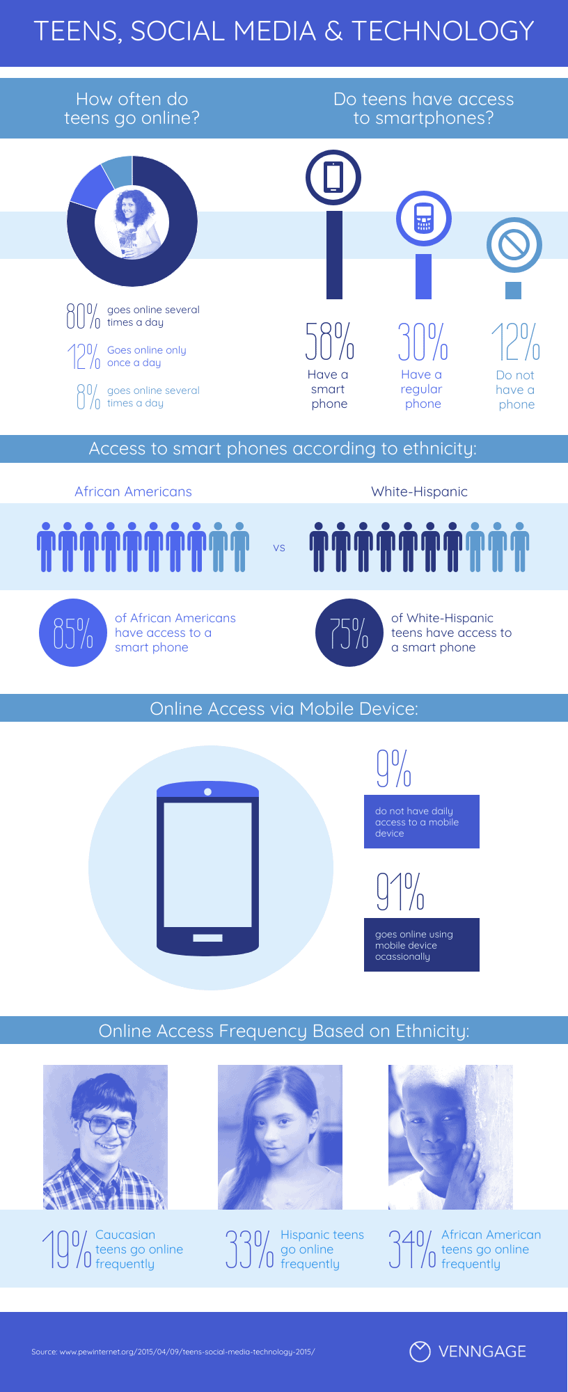
Infographics are a perfect classroom tool because they can make complex information easier to understand. You can create many different types of infographics, depending on the information you want to visualize. In an infographic, you can summarize a topic, show a timeline of events, visualize statistics by chart, graph, or explain a process. The infographic is like an upgraded version of an educational poster.

This visual aid design is good for teaching new studies, or topics with large amounts of information. It is really informative but it is hard to cover all the infographics on one screen. And you might feel difficult if you want to deliver something more than cold text and numbers, like mood, or emotion.
Educational animated video
Fun fact: One minute of animated video equates to about 1.8 million written words (according to Dr. James L. McQuivey from Forrester Research). Educational animations are multi-sensory teaching tools, students can SEE the visualization, LISTEN to the narrator’s script, and FEEL the mood and emotion from the videos (if they deliver it well). Animations can show temporal change directly, rather than having to indicate it by arrows and motion lines. Using animated video can make visual aids not only simpler and less cluttered but also more vivid, engaging, and more intuitively comprehended.
Animated videos are creative teaching aid ideas for every topic, and every content, the only limit is your creativity. However it still has some downsides, and above all is the cost. The most affordable animation option is visual tools and software with a monthly fee of about $40. If you want to have a customized, tailor-made animated video, a simple 5-minute animation is hardly lower than $1000.
# Step 4: Design your visual aids

After brainstorming how a lesson is to be transformed visually, it is finally time for you to get started on the actual design part. (Yay!)
From our experiences working with different clients, this is usually where we meet educators halfway. If you want to add a nice touch to the presentation of the visual or even the consistency of multiple aids, contact us and we’ll give a sample of what it could be like.
Overall, there are two main steps that go into this production house: scripting and concept design.
1. Scripting
This is like an outline before even beginning to write the essay. You need to plan out your visual aid before designing it. This step usually comprises thinking about the main points from the lesson and how they would be delivered. Within your chosen medium, there are a few ways you could script your visuals. The main types of script outlining could fall into one of the following:
- Visualization: This is the simplest form of script writing. It is simply the imagery or visual representation of a concept or idea. It could even be scribbles that help you explain certain concepts.
- Sequence: It emphasizes the link between different concepts by inventing a big picture to fit these concepts in. This style of scripting is actually very useful for students to form a systematic and overall understanding of new knowledge.
- Story-telling: is quite a popular and attractive form of scriptwriting. For this style, rather than merely listing or describing a sequence, you would give your lesson a life by giving it a plot. This style of scripting is also most attractive to younger learners.
Tip: To help students learn better, you could improve the scripting by adding funny and relatable visualizations. Think critically and creatively about the visuals you could use to make your lessons more relatable! These images would provide an extra layer of meaning to both the lessons and the images themselves.
2. Concept design
This is where your script is going to really come to life as the design elements come in. One consideration when it comes to design is your students’ level of understanding and interest. This would tap into two things:

First is the complexity of the visual aid design. This will determine how complicated the images you will use or how many subtitles you will need in your video for example. Studies have shown that materials that underestimate or overshoot students’ abilities will prevent students from learning effectively. Therefore, try to be as fair as possible about what your audience is capable of in a lesson.
Second is the theme of the visual, which is established through design elements. This consists of anything from the color scheme, font, and character design, … While you are free to choose any of these elements to best suit your style of teaching, it is important to keep in mind that some designs are more suitable for a certain audience.
For example, younger students such as primary students would enjoy a more bright, colorful, and simplified cartoon-like style of design. University students or office workers, for example, might prefer a somewhat more tailored color scheme along with a more professional design.
The key here is to really pay attention to what your students are interested in and what they are capable of understanding.
3. Getting it to work

When you finally possess a nice concise script with a chosen visual theme, it is time to get designin’. Before giving a list of the best platforms to try out your design, there are just a few tips to transform a lesson into an effective visual aid design:
- Look for inspiration for creative design everywhere (keep a notebook)
- Exchange ideas with others- something interesting might pop up
- Look for theme and consistency throughout the entire work (it is important to stay focused and concise, to try not to focus on more than one topic)
Now as promised, these are:
The Best 5 Platforms for Creating Effective Visual Aid Ideas!
- Vyond: Educational animation-creating-tool for the very beginner
- Blender: Offline video editing app for educational purposes
- Lesson Up: A platform allows teachers to design a unique lesson for every learner through flexible uses of quizzes and multimedia
- Screencastify: A Chrome add-ons that offer quick and easy recording of yourself and the screen
- Prezi: An online platform that allows the creation of alternative and stunning presentations
- Piktochart: A platform for creating infographics
- Canva: A more versatile online platform with chances to create presentations, brochures, posters, etc…
By now, you should have an understanding of what goes into creating an effective visual tool. However, it is always useful to continue getting feedback and revising it.
Despite the availability of many sources, many educators still get stuck at this design bit. If you’re lacking the time but still want effective visuals, perhaps think about contacting a studio like F. Learning. With 8 years of experience, we’re capable of producing customized visual aids that simplify knowledge and capture learners’s attention at first sight.
6 Visual Aid Design Examples for Effective Teaching
1. Educational posters
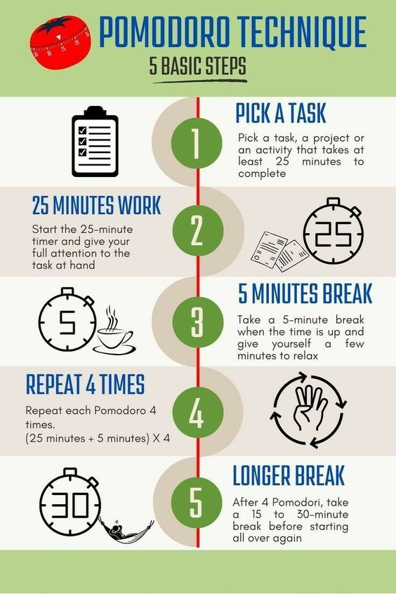
Posters are classic teaching tools but they are still perfect to inspire and remind students of important points. For example, teachers can use the poster below to describe the Pomodoro technique. It uses icons and numbers to present 5 steps clearly, which helps students practice this technique more easily. This template also offers a good idea for you to introduce a how-to guide in other lessons.

If you’re seeking on how to make a visual aid poster, this is a quick guide:
- Define Your Purpose: Determine the main message or information you want to convey.
- Plan Your Layout: Sketch a rough draft of the poster layout and decide on sections, headings, and content placement.
- Choose Visual Elements: Select images, illustrations, and icons that support your message.
- Use Clear and Concise Text: Write short, impactful headings and bullet points, avoid long paragraphs.
- Pick a Color Scheme: Choose colors that complement each other and enhance readability.
- Incorporate Charts and Graphs: Use charts and graphs to present data clearly.
- Maintain Consistency: Keep fonts, colors, and styles consistent throughout the poster.
- Add a Call to Action: Include a clear call to action if needed.
- Review and Edit: Check for any errors or inconsistencies.
- Print and Display: Print the poster on high-quality paper and hang it in your classroom.
2. Flashcards
When it comes to visual aid examples, we should not miss flashcards, which are the go-to choice of many teachers when teaching a foreign language. Students, especially primary ones, love collecting and exchanging flashcards with their friends. Therefore, you should make flashcards as colorful as possible to intrigue them.

3. Illustrations and Photos
Since most people are visual learners, using illustrations and photos as visual aids can significantly enhance the teaching process. Another great aspect of using illustrations and photos is the variety of methods available to create them. You can quickly snap a real photo, paint a picture if you have artistic talent, or use designs created by illustrators – the possibility is boundless.
For example, you can use the illustration below to teach about the stress. From that, your students can easily understand how many levels of stress there are.

4. Videos
As mentioned above, videos, especially animated videos, are a powerful tool in teaching. Mental health is a hard-to-explain topic, but animation makes it a breeze. With funny characters and vibrant colors, It’s more likely that children will totally indulge themselves in the video.
5. Presentations
We’ve all experienced boring presentations before, and I’m sure you don’t want to be the one delivering one! Start by incorporating bright colors and creative fonts into your slide design. Photos, charts, and icons are also great elements to effectively simplify concepts.
Looking at this example, math formulas are much more playful thanks to the block illustration and bold color palette, do you agree?
If you’re interested in exploring more engaging approaches, check out our TOP 8 Great Gamified eLearning Examples in 2026 for inspiration on how to make your presentations and learning experiences more interactive and fun!

6. Student Reports
Besides teaching, evaluating and tracking students’ progress is another crucial aspect of a teacher’s job. So why don’t you make it funny and attractive with a creative design? For younger students, this type of visual aid is very helpful as it makes receiving feedback less stressful and more acceptable.

Conclusion
Visual aid design can certainly take some time and effort but the result would definitely be worth it. We hope that these articles will provide some basic steps to get you started on designing the most suitable tool for your class. However, if you expect more tailored visual aids that reflect your personality and align with your organization, F. Learning Studio can help. Contact us now to discover more about our content development and visual solution service.
- WhatsApp: (+84) 378 713 132
- Email: [email protected]
- Fanpage: https://www.facebook.com/f.learningstudio
- LinkedIn: https://www.linkedin.com/company/f-learning-studio/
Read Further:
- How to make animation for educational purposes work?
- Guide to Create an Awesome Educational Animation for Online Course
- How much does an educational animation cost per minute: $30, $150 or $3,000?

Sean Bui the founder and creative director of F. Learning Studio, is a respected leader in the e-learning and multimedia production industry.
With over 10 years of experience, he has dedicated his career to helping organizations create engaging and impactful learning experiences. Under his leadership, F.Learning Studio has grown into a trusted partner for organizations in the education, healthcare, and corporate training sectors, producing over 2,000 minutes of educational animation.
Sean’s expertise in translating complex concepts into compelling animated videos and interactive learning experiences, as well as his active involvement in the e-learning community, have earned him a reputation as a trusted partner and thought leader in the field of educational technology.


